Game Studio Development
- brandonmcrae
- May 16, 2025
- 3 min read
Updated: May 20, 2025
Material Planning & Research
When putting together an initial idea for the poster, I wanted a clear vision to work towards that would highlight the main appeal of our major project. To do this I gathered a collection of different horror movie posters to analyse patterns and techniques that could be applied to my own.

One detail that stands out in each poster is that the main "Antagonist" is framed in the centre to draw attention to their presence. Additionally, some posters have elements of backgrounds present, a few of which create a bright glow that creates a contrast that better highlights features such as the "Antagonist's" silhouette.
By having these references handy, I was able to begin putting together a first draft of the poster to put some ideas intro practice. My initial vision was to create a post that could almost show a perspective of the player, putting our "Monster" front and centre in a way that makes it feel imposing.
Poster Initial Design
Poster Iterations

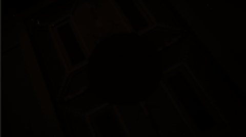
For the first iteration of the poster, I set up a Low-angle, Dutch tilt long shot in one of the rooms of our second level. Using a green point light, I tried to emulate the glow effect from my references by placing it just behind the pillar to allow the light to bounce off the walls and bookshelf behind "Redacted". I placed the title text at the top to use the remaining negative place not filled in with redacted.
As a first draft this was ok but with some feedback there was some work still to be done. To start the green glow was a little overpowering, with deeper shadows leaving a green hue rather than a deep black.


For the second iteration, I applied a number of different effects to the base image such as a "Paint smudge" effect to blend the colours together. I had hoped this would give the poster a more stylized finish, however due to the high resolution of the render, the changes were minimal at best.
With some adjustments to the render's saturation and contrast, I was able to tone down the green hue in the shadows of the room and in addition I added a vignette to cut off excess light.
Final Poster

Trailer
While Nathan was working on the story boards, we agreed on a few early establishing shots that I would put together in engine to give us a foundation to work on. These shots were planned to be used in the first half of the trailer to build of the world and give the player a glimpse of the environments they will be exploring.


Shot 1 - Long-take, slow pan shot aimed give the player a sneak peak into the cabin
Shot 2 - Long-take, slow pan shot with a Dutch tilt applied to generate a sense of disorientation and tension.
Shot 3 - Medium-take, Rotating Dutch tilt, Reverse Zoom shot to create a focus on the centre of the tilt.
Shot 4 - Close-up to Medium, Reverse Zoom shot to create mystery around the central prop.

With my establishing shots rendered, I brought them into Adobe After Effects to start setting the fade timings. My plan was to use a mixture of slow and quick fades to blend the establishing shots together in order to build up tension through world building and atmosphere before revealing gameplay.


Comments