Conor Currie
Week 1
This week, as the introductory week to our asset development, we began research into Roki, and organised our groups. Our group consisted of Conor Currie (Me), Ethan Smythe, Clare McAllister, Nathan Warren and Brandon McRae.
First of all, we put ourselves into team roles. There were three roles, Character Design, Prop Design and Environment Design. I put myself forward for Character Design, along with Clare, while Nathan and Ethan put themselves forward for Prop Design, and Brandon for Environment Design. We then called our team “Slacking Productions”.
In our asset development class, we then settled on putting our first idea forward as an “Abandonded, Snowy Cottage”. We had not finalised the whole narrative but still began to work on concepts and ideas for it.
Our group then created a Miro Board, in which we used to organise reference images. What I did was first create a frame, and put sticky notes saying “Character References”, “Clothes”, and “Facial Features.” This helped me to organise what goes where in the board.
For my original concept, I wanted to work on a woman who had nothing but her eyes showing, as her whole body would be covered by a coat and scarf in order to keep her warm, in order to fully emphasise the winter aesthetic in this character’s outfit, showing to the viewer just how cold the area would be.
For the character references, I decided to try and reflect this, with the photos of the women in the large coats showing how I wanted to portray them both in terms of facial features, skin tone and outfit. I also included an imagine of a cartoon character called “Kenny McCormick”, who showed what I planned to do in terms of outfit in having the whole character almost drowning in a coat, their eyes only being visible from it.
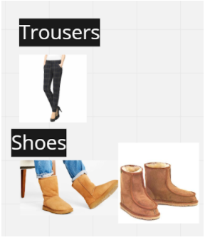
Underneath the clothes sticky note, I broke it down into five sub-sections, Headwear, Coat, Accessories, Trousers and Shoes.
For headwear, I chose to look into waffle stitch winter scarves, in order to find something to cover the character’s mouth. I chose grey as I planned to use light colours for my palette, in order to find a “frosty” palette that compliments the winter aesthetic.
For a coat, taking inspiration from Eskimo culture, I chose two eskimo coats as my reference, and planned to take inspiration from each for my initial design. For the left coat, I planned to use the brown fur, which is very thick and goes all the way down to the bottom of the coat. For the right coat, I planned to take inspiration from the blue colour, along with the pattern near the bottom of the coat.
For accessories, I chose gloves with puffs at the end of them, along with am ice grip walking stick, as this would fit with the environment.
For trousers, while only the bottom part of them would be visible in the character’s design due to the large coat, I chose tartan trousers for the character to wear, as tartan is associated with the winter season.
For shoes, I chose light brown uggs. I chose these as it fits the theme of winter and with the environment, in terms of keeping the character warm. I also chose them as they complemented and diversified the primarily light blue/grey outfit that the character has without contrasting against them.
For facial features, I covered Skin Tone and Hair. For Skin Tone, I took inspiration from the light-brown skin that was reminiscent of Eskimos, and with parts of my character design taking from that culture, I chose to make the skin tone akin to it, too. I also chose to have long brown hair for my character.


Week 2
During Week 2, we began with a call that included further developing our Miro Board. This included adding comments to the work that we have been doing. Some of the comments I added to my work were as follows.
We also had class this week, but unfortunately, during the week, I was unable to meet with my group and was led slightly behind, as I received a positive test for Covid. Due to sickness, I was not able to work that much, but still worked when I could. One thing I did was help set up our Codecks Board, in which we split into ten different cards.
Initial Design Ideas - This is a card which represents our initial design plans, in terms of narrative, silhouettes and design ideas.
References/Moodboards - This linked to our Miro Board, showing all the references we’ve found for our work so far.
Concept Art/Environment Design - This is where our concept art goes, along with concepts for our environment.
Prop Asset List - For Nathan and Ethan, this is where the list of props they need to create go.
Environment Assets - For Brandon, this is where his environment assets will go.
Character Assets - For Clare and I, this is where content created to our 3D model of our character will go.
Special Effects - This is where any effects, such as particles for our model will go.
Final Renders - This is where final renders for our project will go, when we reach that stage.
Project Backups - This is where Backups for our project go.

Week 3
This week I began work on narrative for my character, which I directly worked with Clare on. She changed her character concept to a werewolf who lost their family and had them killed by humans, and lives within the abandoned cabin. This then changed the narrative for my character, and then led for them to become a travelling woman who seeks shelter from the snow within the cabin, which she finds with.
I also created basic concept art for my character this week, as seen below. I attempted to match their proportions to Tove from Roki.
However, I also learned that a more effective way of creating concepts for my character is within creating silhouettes, as that allows me to easily create new designs without putting too much detail within them. Additionally, it allows me to spend an equal amount of time experimenting on each design. I then went through four different concepts. I then did as follows, and this allowed me to then give more consideration to the aspects of each design I liked and disliked.


Week 4
This week, I began work on my face topology.
First of all, I began with pasting two reference planes into the environment. I then modified them to be 180 degrees in rotation from each other. Using the Tove mesh I had loaded, I then sized the planes to to resemble the size of Tove’s face.
These planes were used from two reference images posted onto our trello board.
Then, I created a cube, which I then smoothed out into a sphere using two divisions. I aligned it with the face reference image, and then changed my viewport to front.
From there, I then made the mesh live, and drew over the mesh with quad draw. This was quite hard to do, and you really had to zoom in to get every point. However, eventually, it was finished. I then removed the Sphere from the object. and the face was quite curved. However, some parts of the face were still flat. I then changed from object mode to Edge editing, and double clicked on the upper part of the lip, which highlighted the complete set of edges that made the upper part. I rotated it so that it was not as flat and had more depth.
I then highlighted the edges around the eye, and extruded so there was a single anchor point they all attached to. I then duplicated the face and then changed the X scaling to the variable with a - in front of it, so that the face was flipped. I then took the vertexes between the two and alligned them to be within the same position, so the face could be perfectly symmetrical.


Week 5 and 6 were spent on evolving narrative and our presentation, being worked on in the span of these two weeks.
For week 5, we decided to change our aesthetic and setting. We had originally settled on a snowy cabin, but instead decided to have it in an abandoned viking hall, and had the setting more reminiscent of Roki in terms of it's basing on Norse Mythology. As Clare developed the lore of her character, being a child of Fenrir, I changed my character to have a more Norse-Themed Outfit. Three ideas I had were seen as follows.
I also gave my character a name, being Reginleif. This means daughter of the gods, and while not actually a god, would symbolize her close relationship to the Wolf.
For Week 6, we then made our presentation to Polygon Treehouse about the work we’ve done on the concepts of our characters.
For my slides, I made sure to note the research I did within Roki in developing my character. This research indicated the unique eyes of Roki with defined shadows, different headshapes, lack of outline, cel-shaded artstyle, and small set amount of flat colours.
In terms of referencing, due to our development in narrative towards norse mythology, I aimed to look towards this while finding character designs. I then looked into traditional norse winter clothing for women, and combined the four designs I saw for inspiration.
I then finalized it by showing the concept art of my finished design, followed by the palette. I went over the narrative for my character, being her name is Reginleif, and the wolf symbol on her clothes directly relates to her friendship with Clare’s character, Sigmundr.
I also finalised her palette, being a mix of grey and blue, being representative of her icy nature as a character, along with matching the palette of Clare’s character.


Week 5/6

Week 7
During Week 7, I began my model blockout. I cross-referenced Tove's model, and aimed to create something simple made with cylinders and smoothed cubes to start with.
For the head, I edited the verteces of a sphere, in order to create early hair. It was hard working with perspective on this, as the hair might look good in a front view, but stretched and strange in another. Eventually, I managed to create a simple head of hair over the face topology to start with. I then created fur from a cube which I bended to make a C shape, before editing the vertexes so that it would resemble fur.
I then created basic arms and legs from cylinders, and added spheres between them so it seems there is a bit of a bend, making them look more natural.
Past this, I hope to transition more of the character's outfit into Maya, and move beyond a simple blockout into UVing.
