Our Work
This is your Project Page. It's a great opportunity to help visitors understand the context and background of your latest work. Double click on the text box to start editing your content and make sure to add all the relevant details you want to share.
Week 01 - Research
For the first week of the Asset Development module I began researching into Röki and its artwork for character development.
In this week’s blog I will be looking into:
-
The art style of Röki
-
The characters in Röki
-
And the lighting in Röki
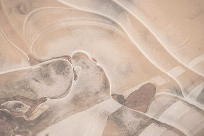
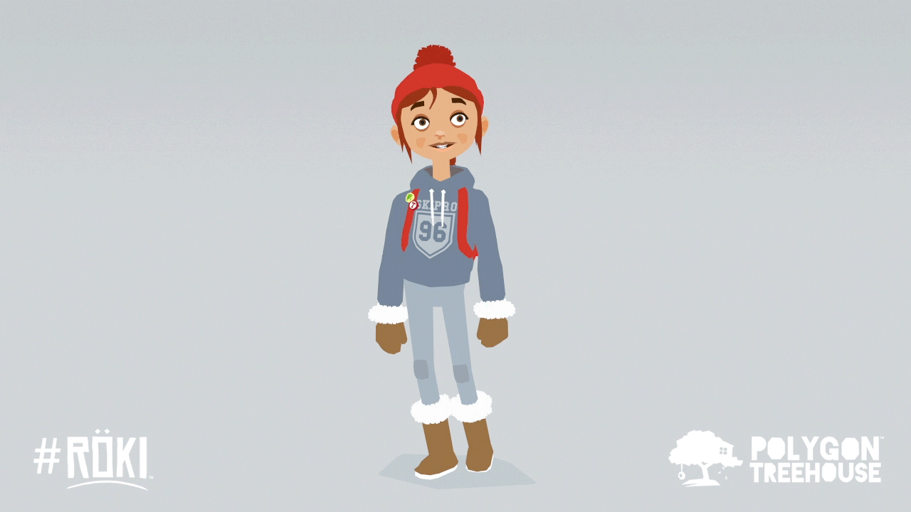
The Art style of Röki
The art style is very simple and fun, although it being a very simple style, Röki is very aesthetically pleasing and beautiful. It adds a lot to the game, like how it conveys characters emotions. Such as when Lars goes missing in the forest, the atmosphere is dark and scary in this scene, reinforcing those emotions in the player.
In contrast to evoke emotions of happiness there are much warmer and well-lit scenes, such as the memory of the family camping trip.
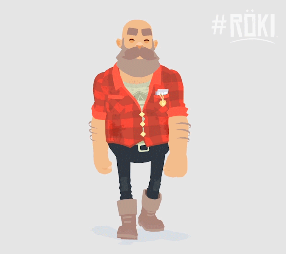
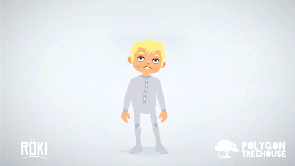
The characters in Röki
The characters of Röki are simple but have exaggerated body proportions, especially Heinrich he has a massive head and torso compared to his small, skinny legs. The use of flats colours and little variations of colours on these characters (and the environment) create a very illustrative style, it is kept simplistic with very minimal details.
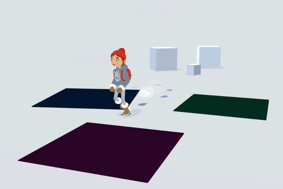
The lighting in Röki
Upon reading Polygon Treehouses’ blog, I found that they do not have lighting in their environments, however they use shadows with different colour variations depending on the scene. They also talk about how the lighting affects the characters, to quote “The characters are similarly unlit, but in their case are tinted by ‘Unlit lights‘ that we place in the scene to bed them into the background”.
With this research I am confident that I can create assets that complement Röki’s art style.
Week 02 - References and Ideas
This week me and my group have been collecting reference images to come up with concepts that we may want to pursue for this project. As one of the character developers I came up with two character ideas. But before I discuss those, I will talk about the concept my group and I have come up with. We wanted to go for a magical snowy abandoned town area, we took a lot of inspiration from Röki. So, from this concept, my first idea was to create a man like Heinrich (big man with beard), but I didn’t want to copy Röki, I wanted to create something different and more creative.
So, me and the group scratched that idea and we collectively decided that the second idea was better, my idea of a magical creature inspired off Huskies and Wolves.
In this image you can see my ideas to make it a relatively magical creature with features such as it having two tails, glowing colour accents on the fur (on the ears, paws and tail), and either the wolf having a third eye or a pattern on its forehead that matches the glowing colour accents.
Using these references, I will create concept art that will help me decide what features I want this character to have.


Week 03 - Concept Art
This week I have been coming up with concepts using the references of the previous blog. For reference on how to make a wolf in Röki’s style I used the wolf guardian as reference. I have experimented with different ideas, and I have made rough sketches to portray what kind of character I’m going for in this project.
This is my first rough sketch of my character; I drew this to get an idea of how the character will end up looking. Below I cleaned up the line work of the character so that I could show more clearly the features that I want this character to have.
Here I experimented with different features that the wolf may have, for example eye types, if the wolf should have characteristics like a pattern on its face or a third eye, I also experimented with scars and if the wolf would have it, and finally ear types. Below I also came up with a colour palette for the character and where these colours will feature.
As seen below I experimented with the different features on the character itself to see which would look best. I decided to choose the pointy ears and the second pair of eyes on the images below.
Here is my final sketch on how the character will roughly look, I decided to go for one of the patterns for its forehead and decided to add the scar. The colour accent on the wolf will feature on the tips of its ears, tails, eyes and on the pattern.
I’ve decided to call this character Wolfie, below I drew the character in a different pose to show how he would behave in its environment.
Wolfie’s personality
Wolfie is very misunderstood, he comes off as scary and dangerous when around humans, humans betrayed his trust and tragic events occurred which explains the scar. Although very scary on the inside he’s actually very kind and sweet once he trusts someone. His likes include sleeping, rolling in snow, getting petted, and howling at the moon. He dislikes people, knives, and fire.


Week 4 - Final concepts
As my initial character design didn’t fit the brief, I redesigned the character keeping in mind my general first concept.
As my group and I decided to go for a Norse mythology narrative and style I created a werewolf based off the mythological character Fenrir, the son of Loki. The character that I created is the third son of Fenrir, called Sigmundr, meaning victory and protection. The word protection in his name has significance within the narrative, Sigmundr serves Odin and protects the gate of Valhalla. This is where Sigmundr encounters Reginleif, the other character in the narrative.
Following the Röki art style, I created a character that is both simple and illustrative. To do this I used minimal detail while using a limited variation of flat colours and exaggerating certain body proportions. As seen above in the second drawing of the character I experimented with different characteristics that Sigmundr may have, such as chains around the ankle or wrist and/or a scar on the eye.
Sigmundr’s personality:
Sigmundr is a very lonely character, Odin banished him to the mundane world to protect the portal to Valhalla to regain the trust between Sigmundr and the Nordic gods. Sigmundr is part God so he is strong and can be very intimidating and scary to anyone who tries to get through the portal. Although very tough on the exterior Sigmundr is very kind once trust is gained. He likes fire, beef and getting petted. He dislikes Odin and being alone.
Concept Art
